Perfection in a Document: Brand Style Guide Tips
| November 4, 2020

Imagine what would happen if you asked a hundred people to draw you a picture of a house. No two drawings would be alike, even if two participants lived together.
Now imagine they’re not drawing houses, but your brand’s logo. Suddenly the stakes are much higher, and the differences become a problem. A brand style guide puts everyone on the same page, so your brand looks and sounds the same across the board.
What Is a Brand Style Guide?
A brand style guide is a document that outlines ideal brand guidelines. It ensures acceptable use of things like themes, logos, tone and more. It also informs company employees how to conform to organizational standards when working on important projects.
Think of a brand style guide as a manual that dictates the feel of your brand. Let’s say a company wishes to advertise a new product they’ve created. They decide to hire a creative marketing company to produce the ad for them.

Now, in order to ensure that this external group knows what type of style and tone the advertisement they should use, the company sends them their style guide. This gives them a simple reference point without the back and forth that otherwise might occur.
The Purpose of a Brand Style Guide
A brand style guide helps brands maintain brand consistency throughout all different types of campaigns, projects and advertisements that communicate with their target audience.
It ensures both internal and external contributors know the expected brand standards and how to implement them.

It also lets a wide range of creators make projects and campaigns that maintain the correct types of design, writing and other project elements.
Now that you understand what a brand style guide is for, let’s take a look at how to create your own.
Need some ideas for what to put inside your style guide? Check out our comprehensive branding guide.
Tips for Creating a Brand Style Guide
First, let me make it clear that no two style guides should be exactly alike. I mean this both in terms of the content and the layout. You don’t need to be unique in every aspect, but there should be at least some semblance of distinctiveness in your guide. Here are some helpful tips to get you started.
Visual Elements
“Design is the silent ambassador of your brand.” – Paul Rand
One key element of nearly all style guides is the inclusion of the brand’s brand’s logo (or logos). Guidelines need to cover how the logo should be in all respects, what color(s) it should be and where it needs to be placed.

The issue that usually arises with projects is logo placement varying, as well as other variables that might be different. Ensure that your guide informs everyone of what to do, so they’re prepared each time.
The next visual element to focus on is font, particularly what type of font should be used for specific projects. Now, keep in mind that different font levels get quite complex and can’t be explained briefly. Instead, you’ll need to use details beyond a font name or size.
Include changeable differences like bold words, italics and underlined letters. Finally, make sure to clarify which type of font is used when switching from a title to a header, or from a header to the content text.
Brand Voice and Messaging
Brand voice is often confused to be something abstract that cannot be directly put down into a guide for reference. This is just not the case, and as you’ll see, you can give exact descriptions of the correct brand voice you wish to portray at all times.

One of the best ways to do this effectively is to create a list of words that describe your brand voice . For example, your voice might be ‘upbeat’, ‘modern’ and ‘dynamic’. Conversely, words like ‘negative’ and ‘rigid’ could be used to show styles you discourage.
Lastly, your brand style guide can outline spelling and grammar rules your brand follows. It’s not always known that spelling differs geographically, so having a clear guide sets everyone straight.
A Story to Set the Tone Going Forward
When many people think of a brand style guide, they think of the many ways it defines a brand through visual elements and rules. Though it does these things, another thing it does is show your overall brand tone, values and ideals.

By including a story about your brand, you give insight into what your brand cares about and the type of brand it is. Depending on what type of brand you are, this story can range from lighthearted to serious to somewhere in between.
Improving Your Current Brand Style Guide
If your brand already has a style guide, do a quick audit to see what – if anything – could be improved. If you find the guide to be outdated, consider keeping a regularly scheduled check to upkeep the overall quality.

The first thing you’ll want to do is determine how well your current guide portrays the values, voice and themes of the brand. This is especially vital, as it gets to the heart of your brand identity.
Next, consider the ways your guide is distributed. Are there things you can do to improve upon this process? It makes a bigger difference than you might think. For example, in the past, brands used to send out a PDF document file to employees and external contributors.
Now there are better ways to deliver the guide. One such is to host it in a central location and send out a link. That way, you can update the document regularly, and people always have access to the most current version.
5 Examples to Learn From
One of the best ways to create your own guide is to first get a glimpse at successful brand’s attempts. Here are five unique brand style guides to consider.
1. Netflix

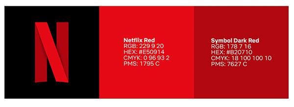
Netflix has set the standard for digital streaming. Their guide focuses on the all-important visual assets that make up their brand identity. Part of what makes Netflix so powerful, after all, is how easy it is for almost anyone to recognize their logo.
What makes Netflix’s style guide stand out: Netflix’s brand style guide not only describes how their visuals speak to customers, it also gives detailed information about how, when and where to use the logo. The guide also makes it easy to obtain files which contain their logos.
Check out the Netflix document here.
2. Microsoft

Microsoft continues to define the way users interact with a personal computer. Their brand style guide explains how to replicate the Microsoft style of writing across different types of content.
What makes Microsoft’s style guide stand out: The complexity of the guide is the first thing users notice. It’s hard to believe that any rock goes unturned with this guide, letting users navigate endless topics concerning the correct brand standards Microsoft has set for themselves.
See the Microsoft guide here.
3. Zoom

Zoom has taken the world of online communication by storm, surpassing more generic platforms like Skype. Their brand style guide gives all the necessary details required to represent the Zoom brand in simplistic, easy-to-navigate fashion.
What makes Zoom’s style guide stand out: The Zoom style guide is filled with plenty of white space. Content like logos and fonts stand out, helping users get it right the first time. Visually, this guide stands out the most among other brand’s guides.
Check out the Zoom style guide here.
4. Apple

Apple manages to be on the cutting edge of technology, forcing the industry to adhere to their own standards when it comes to new tools. Their style guide gives key insight into the best ways to advertise Apple products, including the type of things that detract from the overall Apple message.
What makes Apple’s style guide stand out: The detail of Apple’s style guide is intense. I feel confident that anyone following the document will uphold Apple’s core values and ideals throughout each new type of project and advertisement.
Check out the guide here.
5. Google

Google has set itself apart as the search engine delivering the best results and user experience. Their style guide focuses more on formatting than other brands do, which makes sense considering the way the website operates.
What makes Google’s style guide stand out: Though Google’s brand style guide does include all the different types of punctuation and spelling it requires, it goes much further than that. They have loads of information within about things like headers, formatting and even linking.
Check it out here.
Adapting for the Future
A brand style guide shouldn’t be locked in forever, but instead needs to evolve alongside your brand. As you progress, update everything within your style guide to share the new standards being set. Note that these updates will typically require some type of new advisory and education for employees, so have a concrete schedule in place. However, don’t update the guide too often, either.

Furthermore, note that the only way your style guide can be effective throughout changes is if employees are aware of them. Luckily, digital systems are available to ensure everyone stays on brand and notices new changes.
Final Thoughts
A brand style guide is like a key to a castle. Once users are given the key, they should be able to easily explore it and never again be stuck on the outside looking in.
The power of a brand style guide, especially one that is periodically updated when needed, cannot be understated. Don’t forget the immense responsibility that comes with creating this document.

